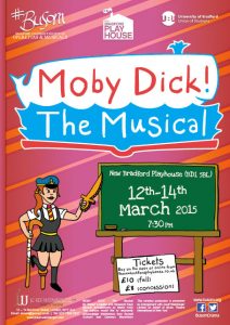
The Bradford University Society of Operettas and Musicals – BUSOM for short – performed their 2015 main show last week. Moby Dick! The Musical sees a St. Trinian’s-like girls school (complete with headmistress played by a man in drag) putting on a musical version of Herman Melville’s novel to save their bankrupt institution; hockey sticks for harpoons and all.
BUSOM’s staple poster creator has graduated, moved away, and become very busy. I was picked to work on the main show this year. That meant it was up to me to get that ‘play within a play’ message across.
First up, posters for the cast auditions. Over the post-Xmas holidays I came up with the below pic, for the production team to surround with the relevant text. This was the birth of Audition Whale, drawn with Illustrator’s standard but useful Charcoal brush.
Audition Whale quickly gained fans.

Immediately after that, we cracked on with the ‘proper’ poster, because they needed to be up a month or two before the show opened. More doodles of blackboards, cutout whales, props, schoolgirls and cross-dressing teachers were put forward.

Using the audition image as a base, working off ideas from the producer, and making sure to fit on the heap of text that the rights providers demanded, I made a fair bit of progress… before we realised it just wasn’t working.

The background, made to match the school ties our costumier had picked out, was garish, and neat as the new ‘whale in a book’ logo was, people preferred the audition poster’s cute one. The schoolgirl in the lower-left was the tipping point.
- She was deemed a bit too saucy. Though still tamer than the poster she was based on, her skirt was a bit short. We lengthened it, but…
- Having her on the left meant making the chalkboard, and all the important text on it, smaller. Also…
- The drawing’s black outline drew the eye away from both the show logo and the chalkboard text. Changing it to a white outline looked pants.
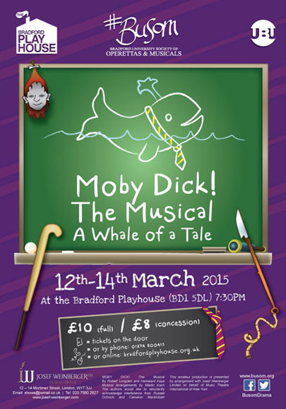
Referring to the KISS principle, the girl was cut, freeing up a lot of space to make the good stuff bigger. The audition whale and its smooth chalkboard made a comeback – no outlines meant more cohesion. The background was muted to purple. A little jiggery-pokery, and we landed at the below result.

Along with enough A4 posters to cover half of Bradford, and the A5 flyers to scatter on pub tables, the Bradford Playhouse displayed an A0-size poster. It’s a little embarrassing that I was excited to see the above at 16 times the size of an average page. I never did find it. I was later told it was outside the playhouse’s rear entrance. Bah.
To be continued. Part 2 will see me banging on about the show programmes…
